How to Use Warm and Cool Colours Together
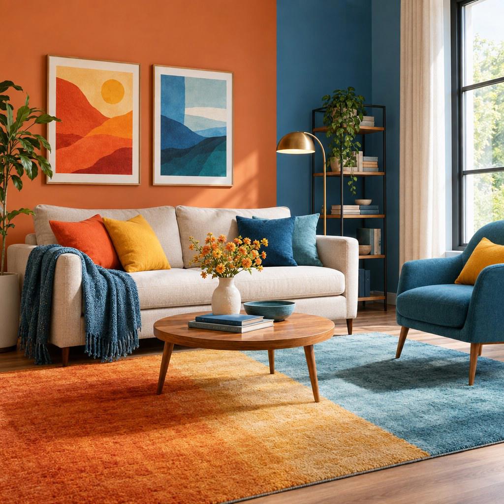
Warm and cool colours work well together when you give each group a clear job: one sets the overall mood, while the other creates contrast, balance, or emphasis. Rather than trying to make every colour equally visible, choose a dominant temperature, use the opposite temperature in smaller amounts, and test the result in the real light where it will be seen.
This approach helps you build interiors, displays, packaging, presentations, and brand materials that feel intentional instead of visually unsettled. You do not need to follow a rigid formula; you need a simple system for judging temperature, value, saturation, and context.
Understand warm and cool colour temperature
Warm colours generally include reds, oranges, yellows, and many yellow-based greens. They tend to feel energetic, welcoming, active, or close. Cool colours include blues, blue-greens, violets, and blue-based greens. They often read as calm, spacious, reserved, or distant.
These labels are useful, but they are not fixed categories. A red can lean cool when it contains blue, such as magenta or berry. A blue can lean warm when it contains red or yellow, such as teal or a muted blue-green. This is why colour names alone are not enough when you are selecting paint, fabrics, graphics, or product finishes.
Why combinations sometimes feel wrong
Warm and cool schemes usually fail because several contrasts compete at once. A bright orange beside a bright turquoise can look lively, but adding a saturated purple, sharp white, and glossy black may make the composition feel noisy. The issue is often not the warm-cool contrast itself; it is the number of competing focal points.
Also consider value and saturation. Value means how light or dark a colour is. Saturation means how vivid or muted it is. A pale dusty blue can sit comfortably beside warm terracotta because both are restrained. A neon blue and a neon orange demand much more control, even though they are based on the same temperature contrast.
💡 Tip: Compare samples beside one another, not separately. A colour can appear warmer or cooler depending on the colours around it, the available daylight, and the surface finish.
Choose a dominant temperature before adding contrast
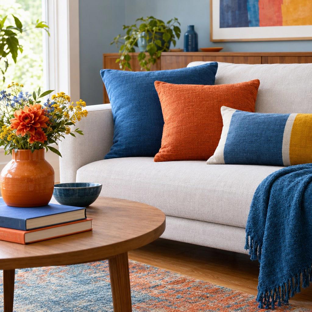
Start by deciding what the space or design needs to communicate. If you want a room to feel relaxed and open, build from cool colours and add warmth through accents. If you want a café menu, retail display, or communal area to feel sociable and energetic, use warmth as the foundation and cool tones to sharpen the composition.
Giving one temperature the leading role makes later decisions easier. The dominant family can cover the largest surfaces: walls, background fields, large furniture, main packaging panels, or primary brand graphics. The secondary temperature then directs attention to smaller elements such as cushions, labels, buttons, artwork, trim, or calls to action.
Cool-led scheme
Use blue, green, or violet as the main field. Add clay, coral, brass, warm wood, or soft peach where you want people to pause or look closer.
Warm-led scheme
Use warm neutrals, ochre, terracotta, or red as the visual base. Introduce blue, slate, or green to give the scheme definition and breathing room.
Neutral colours can support either direction. Cream often strengthens a warm palette, while blue-grey supports a cool palette. True white, charcoal, and some greys can appear neutral, but their undertones still matter. Check whether a grey has a blue, green, pink, or yellow cast before treating it as a blank background.
Build a balanced palette with contrast you can control
A useful palette has more than a warm colour and a cool colour. It also needs neutrals and a clear hierarchy. Begin with 3 roles: a base colour for broad areas, a support colour for secondary surfaces, and an accent colour for attention. Add a neutral only when it helps separate those roles or gives the eye a resting place.
Match the intensity before judging the temperature
For a calm result, pair colours with similar softness. Sage green and muted rust, powder blue and faded coral, or navy and warm tan can feel connected because their intensity is comparable. For a more graphic result, let one highly saturated colour meet a quieter opposite. A vivid cobalt logo, for example, can stand out clearly against a warm sand background.
Avoid making every item bold. If the base, support, and accent colours are all dark, bright, or highly saturated, the eye has no obvious route through the composition. Reduce the saturation of one element, increase the amount of neutral space, or make the accent smaller.
Use warm and cool neutrals deliberately
Neutrals are not an afterthought. Warm beige, mushroom, camel, and brown can soften a cool blue or green scheme. Cool grey, stone, charcoal, and off-white can steady a palette built around orange, mustard, or red. Choose one neutral direction first, then test whether the opposite-temperature accent still reads clearly against it.
- Use a warm base with a cool accent when you want a welcoming setting with a crisp focal point.
- Use a cool base with a warm accent when you want calm surroundings with a point of energy.
- Use closely muted warm and cool tones when you want a layered, understated result.
- Use bright opposites only when strong contrast supports the purpose of the design.
Apply colours in practice: a step-by-step process
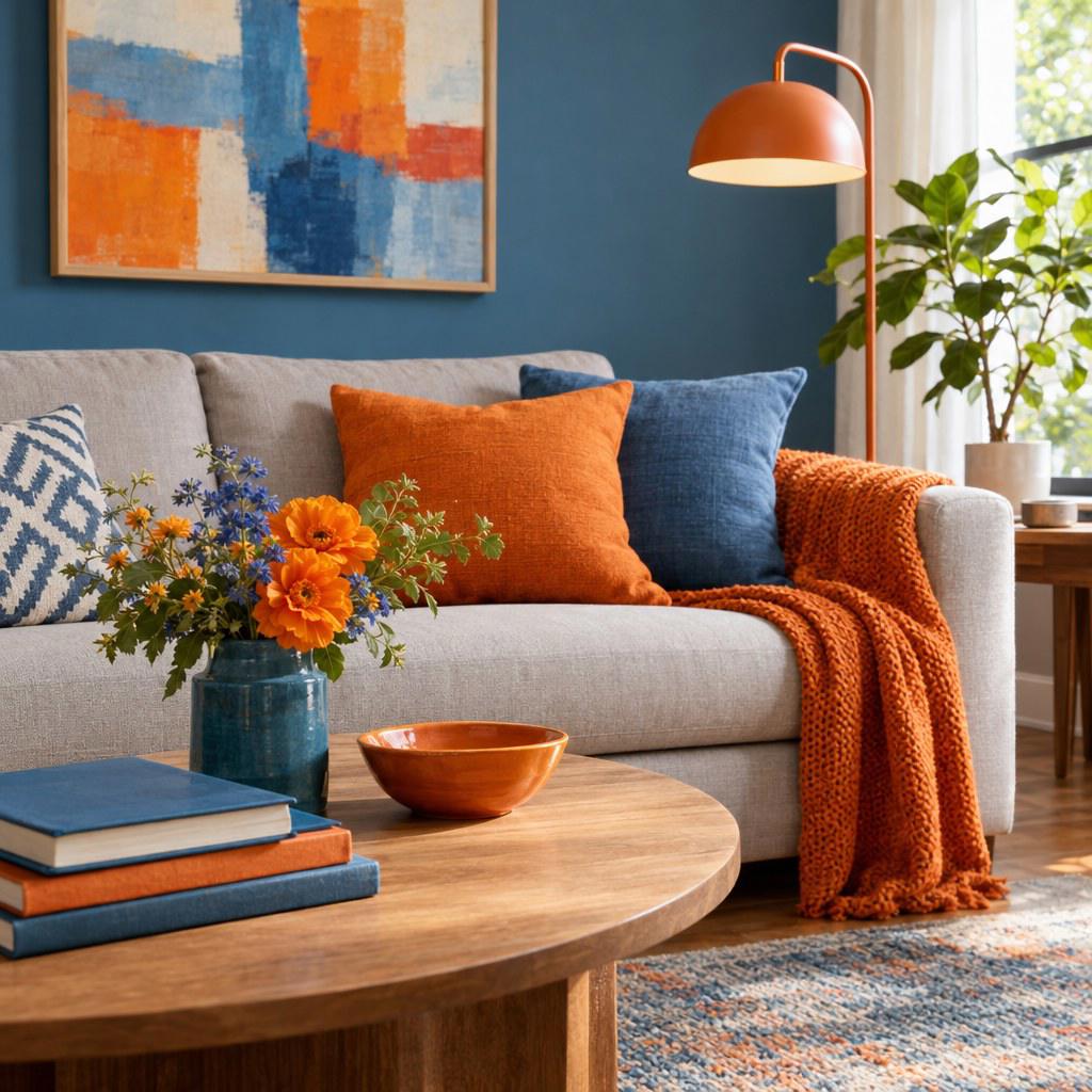
Use the same sequence whether you are planning a room, assembling a product display, or reviewing visual marketing materials. The scale changes, but the decisions remain similar.
- Define the purpose. Write down the intended feeling and action. For example, should the area feel restful, creative, premium, friendly, or highly visible?
- Select the dominant temperature. Choose warm or cool based on that purpose, then identify the largest surfaces where it will appear.
- Choose 1 contrasting accent. Pick an opposite-temperature colour that fits the desired energy level. A muted accent is usually easier to live with than a very bright one.
- Add 1 or 2 neutrals. Use them to connect materials, text, furniture, or background space. Check undertones before committing.
- Test at the real scale. A tiny swatch cannot show how a wall, webpage banner, or storefront sign will feel. Mock up the largest important surface first.
- Review under actual conditions. Look at physical samples in daylight and artificial light. For digital work, check the palette on the screens your audience is most likely to use.
- Reduce before adding. If the result feels busy, remove an accent or simplify a pattern before introducing another colour.
For example, if you are refreshing a waiting area, you might use soft blue-grey walls as the cool base, warm oak furniture as the supporting warmth, and a small amount of muted coral in artwork or cushions. The blue-grey keeps the room composed, while the warmer materials prevent it from feeling cold.
Avoid common mistakes and know how to recover
Using equal amounts of competing colours
When intense warm and cool colours occupy similar amounts of space, they can appear to compete. Recover by choosing one colour to expand and reducing the other to a smaller accent. You can also mute one colour with a related neutral.
Ignoring undertones in materials
Paint, textiles, flooring, wood, metal, and printed paper reflect colour differently. A beige wall may look pink beside one floor and yellow beside another. Bring samples together before ordering, and view them against the fixed elements you are not changing.
Adding contrast without a focal point
Contrast should guide attention somewhere useful. In a presentation, reserve the warm accent for key figures, labels, or decisions. In a room, place it where you want visual weight, such as a seating area, an art wall, or a single statement object.
⚠️ Check before committing: Gloss, texture, and surrounding light can change the apparent colour temperature. Test a finish, not just the colour chip.
Make the final decision with a simple framework
Before approving a colour scheme, ask 4 questions. Is the dominant temperature aligned with the purpose? Does the contrasting temperature have a specific job? Are saturation and value controlled enough that the hierarchy is clear? Have you tested the palette with the real materials, lighting, or screen conditions?
If you can answer yes to all 4, the scheme is likely balanced. If not, do not assume you need more colour theory. Usually, you need fewer competing hues, a stronger neutral, or a clearer focal point. Warm and cool colours are most effective when their relationship is easy to understand at a glance.
Start with a small, testable palette
Choose 1 dominant temperature, 1 contrasting accent, and 1 neutral. Test them together at full scale before you buy, print, paint, or publish.